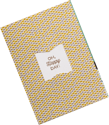
We recently completed a few projects for Gränd Salon that we are excited about and have been eager to share with you all! Gränd Salon, owned by Shelly Rewinkle, moved from their LoDo location to a customize space in LoHi on 35th and Kalamath street. The new building was transformed from an old plant warehouse into an industrial yet zen atmosphere with a larger studio for their stylists, more room for retail, plus spa-like amenities — nail services and reclining shampoo stations. Ahhhhhh. We created a fresh new look for their existing brand to better fit their new space, including a new website, business cards, appointment cards, service cards, and custom emery boards. Mood board images sourced here Expanding the brand We started out developing a mood board for their brand. We focused on collecting images that were edgy, hip, organic, yet clean and modern to communicate the feel. Then combined the existing red circular logo with new typefaces and natural elements of the interior to establish the look. The mood board set the tone for each element under the brand. The website launched on Jan 11, 2013, opening day at the new studio. We designed, developed and customized the site using
Quite the showstopper, the capital Q is a defining character in a typeface. The quality of its curves and swash encapsulates the style of a family of letterforms and offers a place to be a little over the top. Many typophiles have a mental catalog of which typefaces sport the best Qs... and question marks... and ampersands. Quenching your curiosity: Bembo and Trajan have classic Qs with restrained elegance and flow. Mrs. Eaves, a contemporary serif, quarantines balance within its curves. For the less-is-more camp, you can’t ignore the quietude of the Gotham sans serif Q. No fuss, no muss. Ding! It’s ready. Quintessentially, Q is the perpetual drama queen…not merely an O with ornament. Q’s unique qualities can make it the life of the party. It carries more subtlety than the arresting X or zany Z. Never lacking for companionship, Q does everything with a flourish and travels with an entourage. A loyal companion, the ubiquitous lowercase U is as unassuming as Q is demanding. After all, Q aspires to be uppercase most of the time and can be spotted seeking drop-cap status, though it rarely attains it. It’s fated to be typecast as a character actor. Quirky to dramatic, Q can make or
This June, AIGA Colorado is honoring two of our brightest and boldest creatives to be recipients of the prestigious AIGA Fellow Award. The Fellow award program is a means of recognizing designers who have made a significant contribution to raising the standards of excellence in practice and conduct within their local or regional design community as well as in their local AIGA chapter. The areas of education, writing, leadership and reputation, as well as the practice of design are given equal consideration in measuring significant contribution. I’ve been honored with the request to design the gala event invitation. At the 2011 Fellow awards, I had the opportunity to make the introductions for one of my favorite people—a fine Fellow she is. I would like to share with you a little about my wonderful friend and colleague, Marian Halliday. AIGA Fellow Award 2011: Marian Halliday Star Date: June 2011 — Introduction Speech Huh-looooooo! Good evening. I’m pleased to have the honor to introduce one of my favorite people in the graphic design industry, Marian Halliday. Or as some of you may know her affectionately as Marian Jolly Halliday, Maid Marian, Marian, Marian the Paper Librarian, or even... Marian the Barbarian! You


