September 18, 2024 - Comments Off on Challenges, Triumphs & Spin
Challenges, Triumphs & Spin
Tuning into inspiration
I relish the Olympic games. From the nuanced steps of dressage to the resilience of rugby 7s — New Zealand took Gold! — the Olympics bring out our best qualities. I watched these sports … and badminton, tennis, judo, basketball, table tennis, fencing, swimming, gymnastics, soccer and diving … all on the first day. The branding of the games in Paris is captivating, expertly marking the venues throughout the city. Aerial views of the Arc de Triomphe, athletes floating down the Seine, beach volleyball in the shadow of the Eiffel Tower: This was 16 days of heaven. And the Paralympics start on August 28th! Now we can watch even more.
Hearing athletes’ stories of overcoming obstacles and injuries helped ease my recovery from meniscus surgery. A summer without tennis? Noooo! But setbacks are all about perspective. “What can I do?” I challenged, while RICEing each day. Serving up a fun summer required a bit of spin. I scheduled my procedure around our trips and worked with a trainer to keep up some level of fitness.

Summer = travel = adventure
June brought smooth sailing along Croatia’s Dalmatian Coast where the sea is beautiful, deep blue, clear and … calm. Preferring excitement to still waters, we spent time adventuring through small, illuminated caves exploring the charming coastal villages that dot each island, and sampling the local fish. Black risotto? Yes, please! The trip ended with negotiating Dubrovnik’s 1,000+ steps — a last hurrah for the meniscus — while touring the walls of the city. Enchanting!


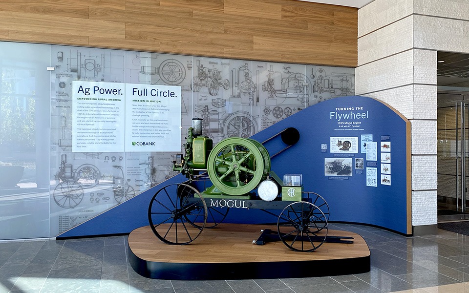
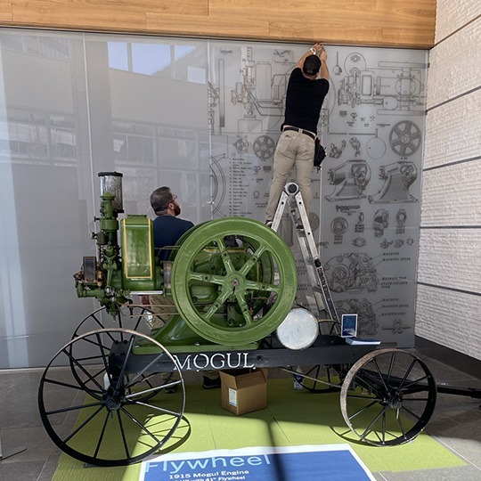
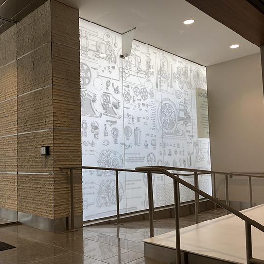
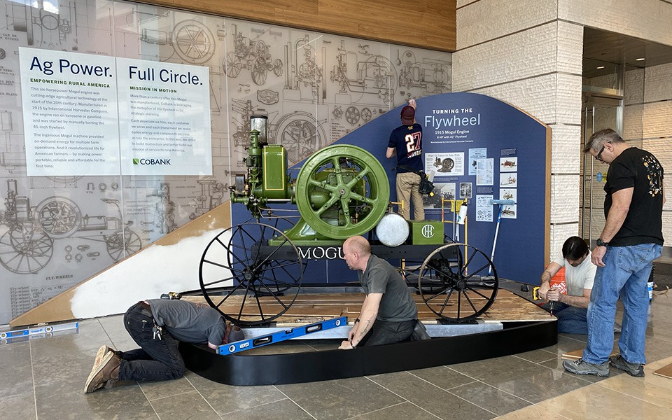
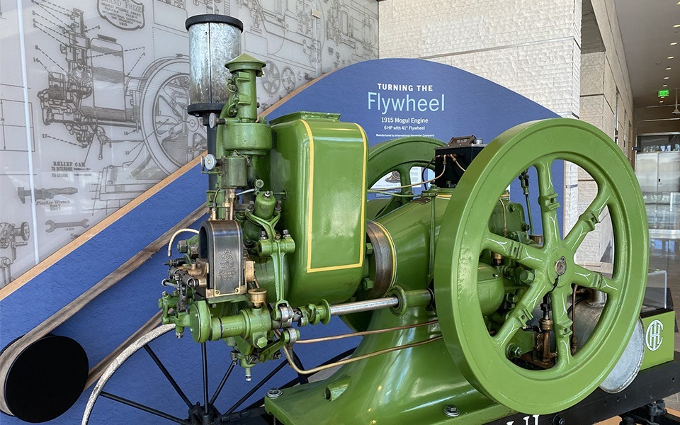
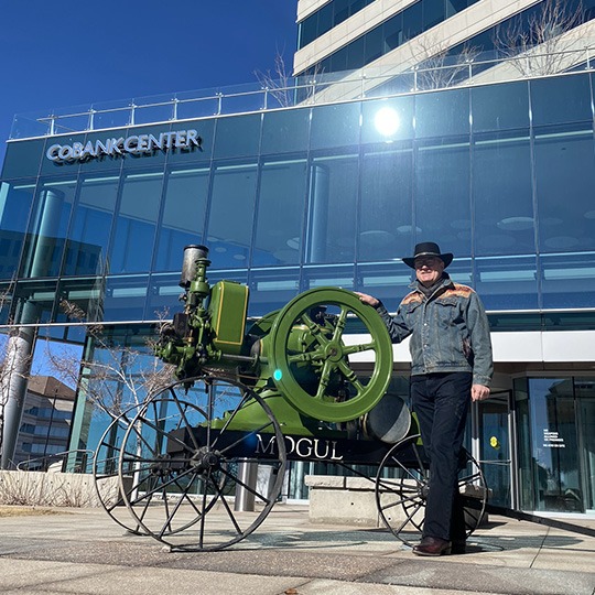
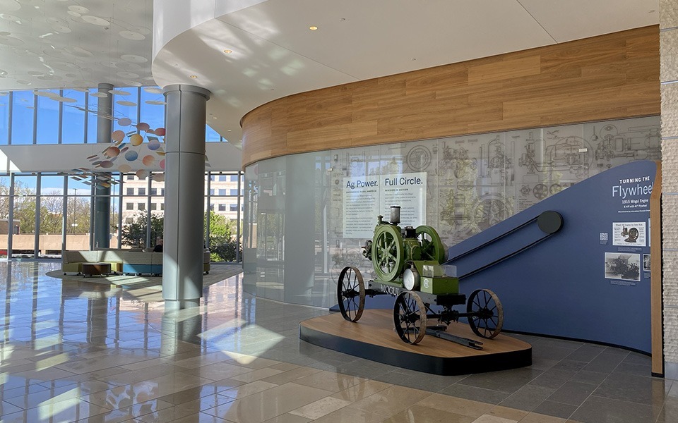
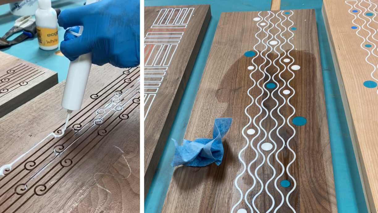
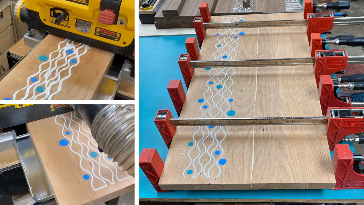
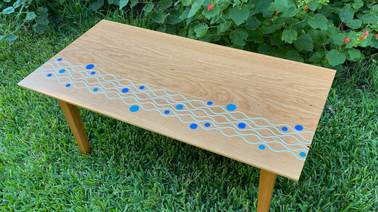
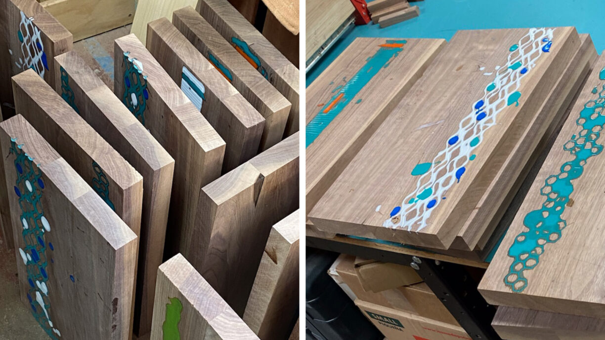
Then it was home to Denver, a breath-catching day with the dog, and back to design. This challenge was a custom wallpaper for CoBank, a spin-off of the Flywheel Installation completed earlier in the year. The images behind the Mogul were redesigned into a repeat pattern, spanning three 48” panels. They printed tone-on-tone in a hue from their interior space on linen-textured, commercial-grade wallpaper. Nocerino Editions did a beautiful job color matching a paint chip, and it was installed in mid-July. Now we’re printing even more.


Gaining a kneeded perspective
The next week, I rolled out of surgery and departed for Breckenridge, our home away from home … with everything conveniently on one floor. Not hiking was getting me down, so I had to create joy another way. The view from my “Boffice” inspired a “Christmas in July” pattern collection of dancing ornaments, pinwheeling poinsettia and a classic harlequin motif. Transported and refreshed, I could tackle recovery with a bit of optimism. After several weeks of focus on PT, my bend and extension were close to normal. Now I’m doing even more.


As I wrote this, I was taxiing on a plane bound for New York to meet up with family. We had a great visit with my dad and brother here from New Zealand. I filled up the inspiration coffers at the MoMA, the Guggenheim, The Met, and the theater. Then we ventured on to Cape Cod to catch up with more family & friends. Sailboats. Sandbars. Seafood. A salty pattern collection is in the works.
Cheers to plan Bs and calm seas! Now be inspired even more. Visit my Instagram.