May 9, 2024 - Comments Off on The Little Engine That Did
The Little Engine That Did
How many hands does it take to start a 1915 International Harvester Mogul engine?
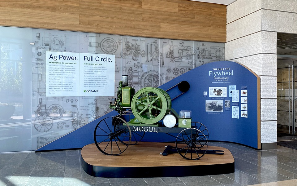
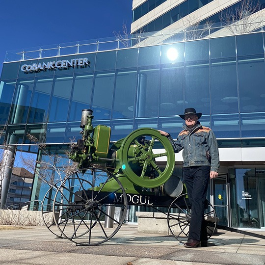
If we’re talking about the bright green machine that’s welcoming guests to the CoBank Center in Greenwood Village, Colorado, the answer is more than a dozen. And it all began with an EnZed client’s challenge.
Helen Young has been creating unique marketing projects for CoBank for more than 15 years. So she wasn’t surprised when Arthur Hodges, chief of staff, asked what she knew about flywheel engines. She admitted she knew zip, being a Kiwi from New Zealand and not a kid from the Heartland. But when he explained how the organization wanted to acquire one of the historic farm implements for their office tower’s lobby, she was in. The right one, he explained, would do three things: pay tribute to CoBank’s agricultural cooperative clients, stand as a symbol of the momentum ag lending creates, and be the story-telling focal point of a built display in their art collection.
The wheels in her brain began spinning.

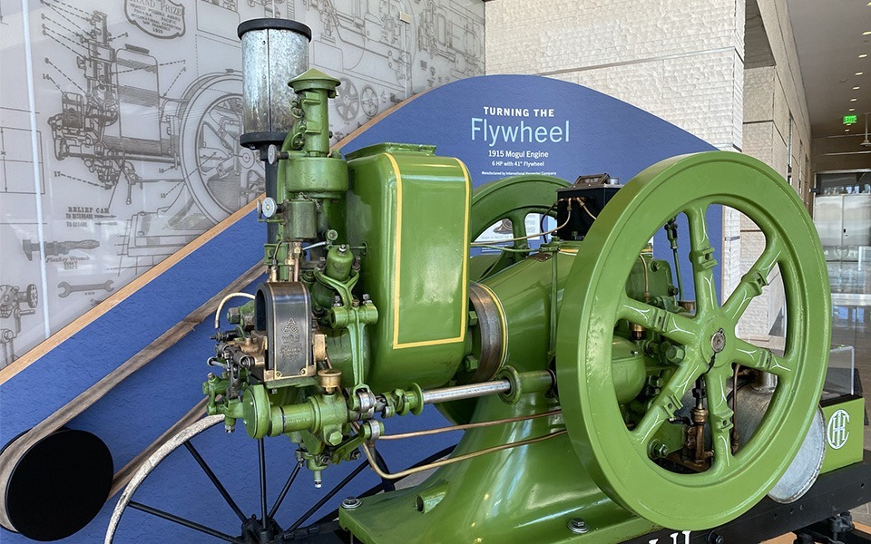
This cart-mounted Mogul flywheel engine weighs 2,526 pounds and is 8’6” in length with a detachable 4’6” front pull. Harnessing a horse to the front pull gave early 20th century farmers a portable power source to saw lumber, milk cows, run shellers and more.
Helen scouted vintage farm equipment online, made calls, and discovered a community of machine-loving history buffs stretching nationwide. A fine flywheel example was being auctioned by Gene and Renae Rosenberg of Spirit Lake, Iowa. She conferred with CoBank’s team who confirmed that the engine would, indeed, fit through the lobby’s glass gateway with all of two inches to spare. Installation? Check.
She then called Carla Carwile, EnZed’s writer for the past two decades and an Iowegian by birth, to start the project narrative. Whereupon Carla called her friend Brenda Davis DeVore, director of Prairie Trails Museum in Wayne County, Iowa, picked her brain and connected her with CoBank’s Hodges to get the grist of early 20th century farm implements. Storyline? Check.
Helen, meanwhile, watched the online bidding window draw to a close (whew!), flew to Iowa to finalize the deal, and found Brandon Slepicka, a collector of flywheel engines in Johnstown, Colorado, to operate the Mogul in its new Rocky Mountain home. Logistics? Check.
You can see it running here.
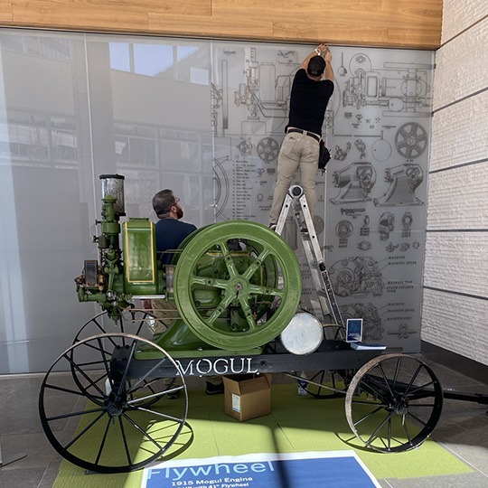
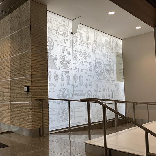

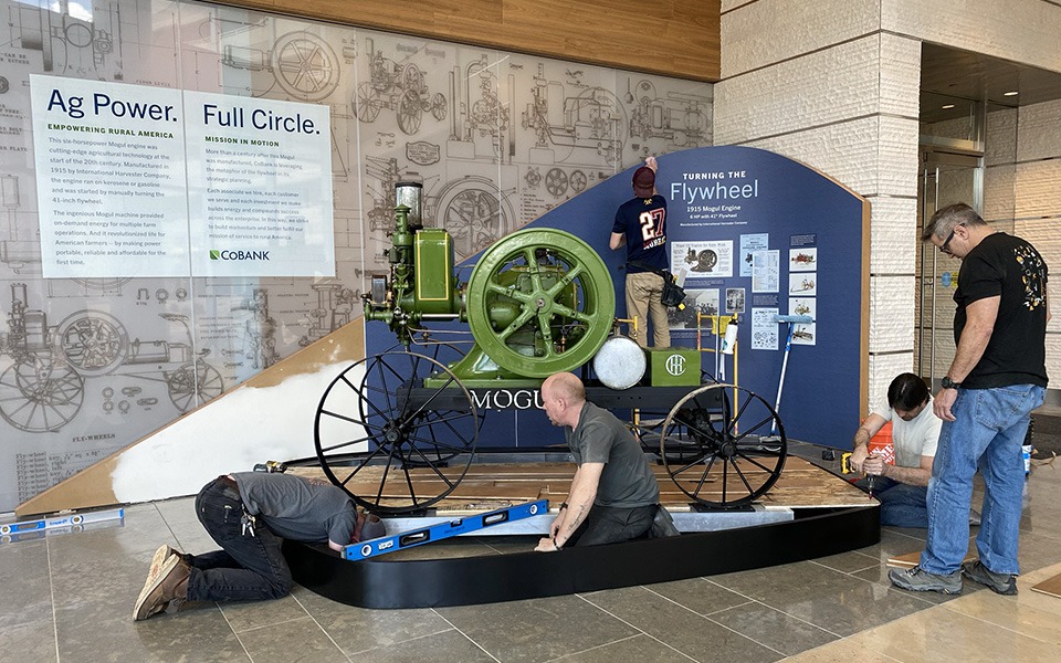
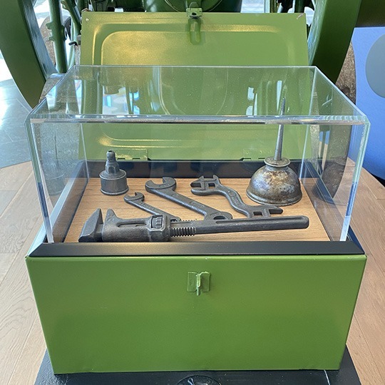
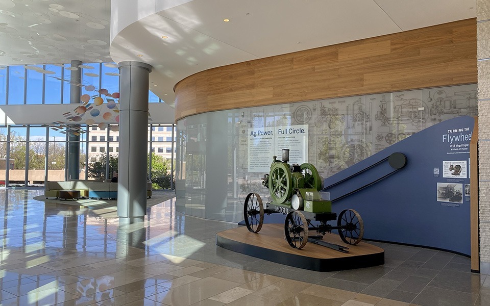
Next, she met with Denver’s Make West team to collaborate on design and bring the display to life. In tandem with Leslie Wirtz, senior manager of CoBank’s creative services, Helen would direct the overall installation plan and design the text, colorways, surface patterns, and graphics explaining the Mogul’s role as both ag-changing machine and CoBank metaphor. MakeWest would engineer and craft the curved wall anchoring a walk-around pedestal base for the Mogul, integrating all with the center’s glass-and-stone interior. The finished work would display the green machine, original tools in the toolbox, and CoBank CEO Tom Halverson’s own vintage family photos of a flywheel assisting with Iowa farm operations in the 1930s. All involved shared the goal of a finished conversation-starting display worthy of a place in CoBank’s stellar art collection. Success? Check.

The moral of this story? Maybe it’s that many hands do, indeed, make light work. Possibly it’s that the past still has a presence. Or perhaps it’s that momentum — like crops and companies and creativity — grows when the right energy is set in motion.
— Carla Carwile