August 27, 2021 - Comments Off on Be a designer. (Or… just look like one.)
Be a designer. (Or… just look like one.)
As creative software becomes more accessible through subscriptions such as Adobe Creative Cloud and online platforms like Canva, clients now have the power to create better looking materials to promote their ideas and services. While most Marcom professionals and savvy small business owners can tackle the technical side of communications capably, there’s a level of finesse that only comes from formal design training and years of practice. (This is where having experienced creative partners in your corner can make a major difference in branding and marketing impact.) But by applying some basic design principles to your presentations, proposals and social media posts, you can elevate your messages and your brand.
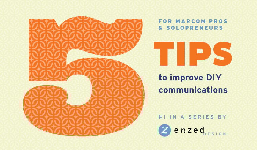
Here are five tips to help when you can’t hire a graphic designer.
1. Choose your color palette. Keep it to three colors, plus one or two lighter hues as backgrounds for sidebars (e.g. orange type in a cream sidebar). Select a dark color for legible type, a brighter color for headlines, and a medium color for subheads, pull quotes, etc. Keep in mind universal color meanings, too: red can be aggressive and signal stop or a warning; green is softer, optimistic and can indicate something is eco-friendly, etc.
One of my go-to combinations: Navy headlines, lapis blue subheads, black body copy, dark gray sidebar copy on an ice blue background. I’ll have more ideas on great color combos with palette examples to share in a future article.
2. Choose your typefaces. Only two. Select a sans serif family (e.g. Helvetica) and a serif family (e.g. Garamond) and use them together to create a hierarchy of information. A hierarchy is like an outline — it indicates how you read through the information. Headlines, subheads, pull quotes, sidebars, tables, and captions are typically in a type hierarchy.
Within each typeface, you have many fonts so you really can use 6-8 styles in a document. (Whew!) A typeface is a family, such as Garamond, but a font is a specific style (aka weight or cut), such as Garamond Bold. Think of it this way: typefaces are to an album, as fonts are to songs on an album.
Example of a type hierarchy:
- Headlines are 24 point Helvetica Light
- Subheads are 12 point Helvetica Bold
- Body copy is 9 point Garamond Regular
- Tables use 8 point Helvetica Regular & Bold
- Pull Quotes are 12 point Garamond Italic
In a future article, I’ll cover why you should limit the use of ALL CAPS, how to select typefaces that communicate your brand personality, and show you some great hierarchy examples that are easy to implement on your own.
4. Keep it simple. If everything “pops,” all you have is a bowl of popcorn. So figure out your hierarchy and make sure that you present the information in a way that your audience will understand it. Use imagery, color and copy to draw the reader through the material or focus on a single message you want them to remember most.
“Less is more” was Mies van der Rohe's mantra that defined the modernist aesthetic and it can define your presentations too. Avoid being tempted to use all of the effects the creative software offers because it’s fun. Choose one effect that you think adds to the communication and stick with it throughout the document as part of your hierarchy. Consistency is key to a good looking and user-friendly communication piece.
I’ll address common graphic mishaps and how best to use imagery and graphics for a consistent, branded look throughout your documents in a future article.
4. We love alignment. Set your margins and stick to them. Start your copy at the same point on the page from the top and left edges. Maintain the styles of your headlines, subheads, and body copy (size and leading, aka line spacing) throughout. Don’t change the sizes to fit content, rather edit the content to fit the space. If it doesn’t slim down enough, then add a page.
Avoid flush-right and justified text as it is less natural to read and can often create awkward white spaces (called rivers) flowing through the copy. I’ll discuss flush left and centered type options, plus how to draw the eye through bullet points and positioning of elements, plus header and footer options in a future article.
5. Present one idea at a time. Pick the most important take away that you want your audience to remember and make it the most clear and prominent item on the page or post. If you’re presenting a deck, you really just need a couple of top-level bullets as an overview, not a full sentence that they are reading as you speak it. Place the minimum amount of content you need to get your idea across on the first slide. Then use a page to further explain each item individually. People will listen to you more and understand better if the page is minimal.
Choose imagery to further communicate your ideas, not just fill space. Also, give yourself and your audience a place to rest their eyes between large blocks of information. They will appreciate the visual break and let the information they just absorbed sink in. I’ll provide insights into how to use photography and other imagery to maximize comprehension in a future article.
One last pro tip, never, ever use Comic Sans unless you’re creating a comic book.* Designers everywhere will thank you.
— Helen C Young, owner & creative director, EnZed Design, LLC
*Curious why? Search “Why do designers hate Comic Sans?”


Comments are closed.