May 17, 2021 - Comments Off on Branding and the Power of Pattern
Branding and the Power of Pattern
The most memorable brands do not live by logos, alone. Instead, they leverage their well-designed mark in every possible manner. The conscious, consistent use of fonts, colors, tone and positioning adds dimension. Some even encompass scent and sound to elevate distinction.
One of the simplest ways to mark territory is through the development of a custom brand pattern. Possible applications range from a subtle background for an engaging website to a star-powered position on a best-selling product.
We create custom patterns for clients by using elements of their logo in proprietary designs. The objective is to add texture and depth across multiple media for optimal visibility. Branding demands reinforcement, and this is one more way to achieve it.
Here are examples of logos we designed and their custom companion patterns.


The Power of Process
When I create a custom pattern for a brand, I start by looking at the elements and shapes in the logo. Whether it is a new logo designed by my firm or an established mark, we address it the same way — identify the most significant visuals and build on them. We also consider how to create a seamless repeat with these elements.
Repeats can be horizontal, vertical, diagonal, block or offset (partial drop or brick). Certain shapes and scales lend themselves to different repeat styles. For example, round shapes half-drop well in an offset repeat because the shapes fit into each other snuggly. Asymmetrical core shapes require additional elements around them to create a block repeat. It takes some experimenting to eliminate striping or gaps for a clean, seamless repeat, especially in designs that need to “read” in all directions (not just up and down, as on wallpaper).
Brand patterns must apply well on myriad surfaces — electronic media; printed small or large on paper, fabric and other substrates; and often rendered flat or dimensionally (e.g. routed into metal). Because these factors can influence the motif’s complexity and color palette, it’s best to know where the pattern will be used before beginning design. Once these specifications are set, it’s exciting to see the variations that emerge. Often, more than one design hits the mark, resulting in a suite of brand patterns that can serve as a library for the client over time.
The POW! of Results
Here are some examples of designs we’ve created that make it easy to see how the patterns relate to their brands.
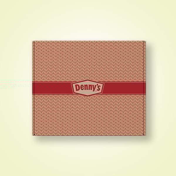
- Denny’s to-go boxes — Their signature French diamond was overlapped and rotated to create a geometric pattern that also looks like a box motif.
- Blackbird General Store tissue paper — The illustration of the bird and branch in the logo was reworked as a toile pattern, a custom take on traditional fabric that reinforced the nature of the brand.
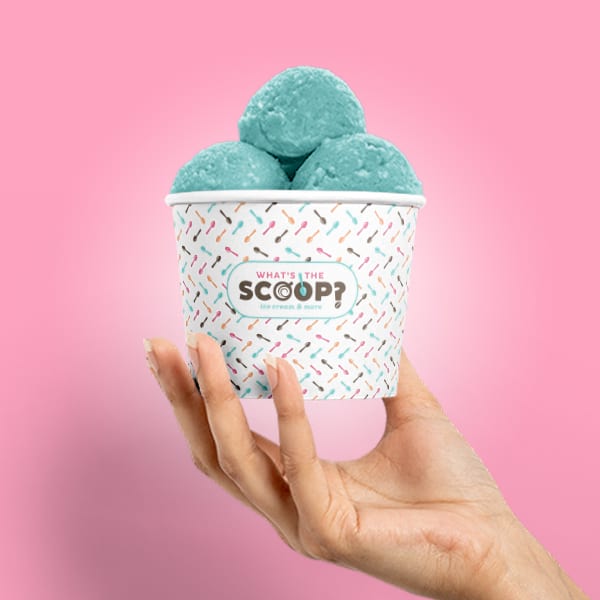
- What’s the Scoop? cups — The spoon from the “O” is repeated in a simple linear pattern that feels like sprinkles on ice cream.
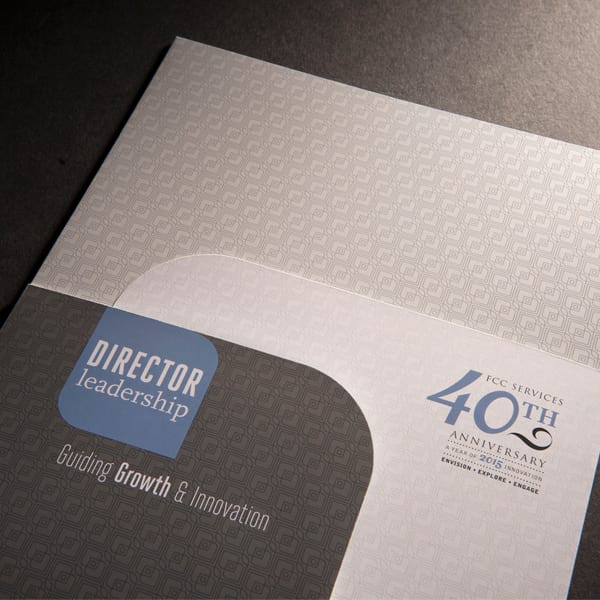
- FCCS conference folders — The conference logo shape repeats in a fine-lined geometric micro-pattern, acting as a texture (further enhanced with gloss and dull varnishes).
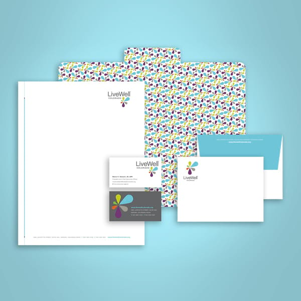
- LiveWell Colorado branding — The colorful burst created the perfect any-direction pattern for branding a variety of communications.
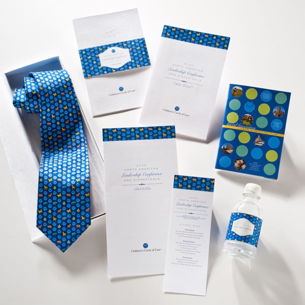
- Children’s Circle of Care event — The heart of the logo combines with icons from the host hospital to create a pattern to brand the event through a custom tie (fabric), invitations (paper), water bottle (plastic) and more.
Enrich your brand with a custom pattern that creates instant recognition wherever it goes.
And it can go virtually everywhere.
Contact Helen to get started.



Comments are closed.