All Posts in print design

April 17, 2018 - Comments Off on Giving back is always in style

Giving back is always in style

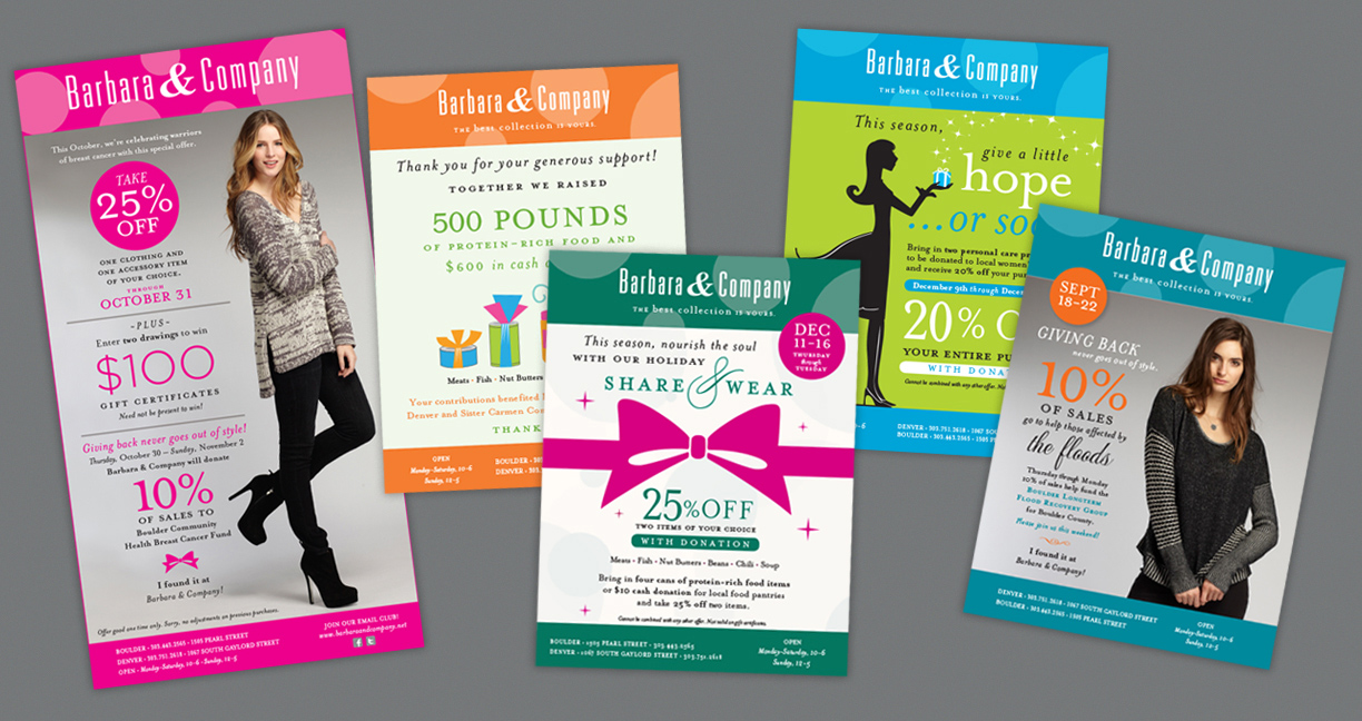
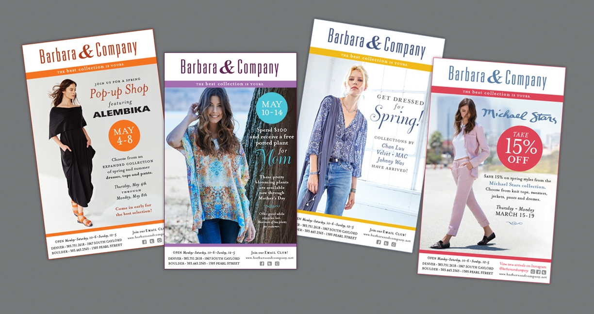
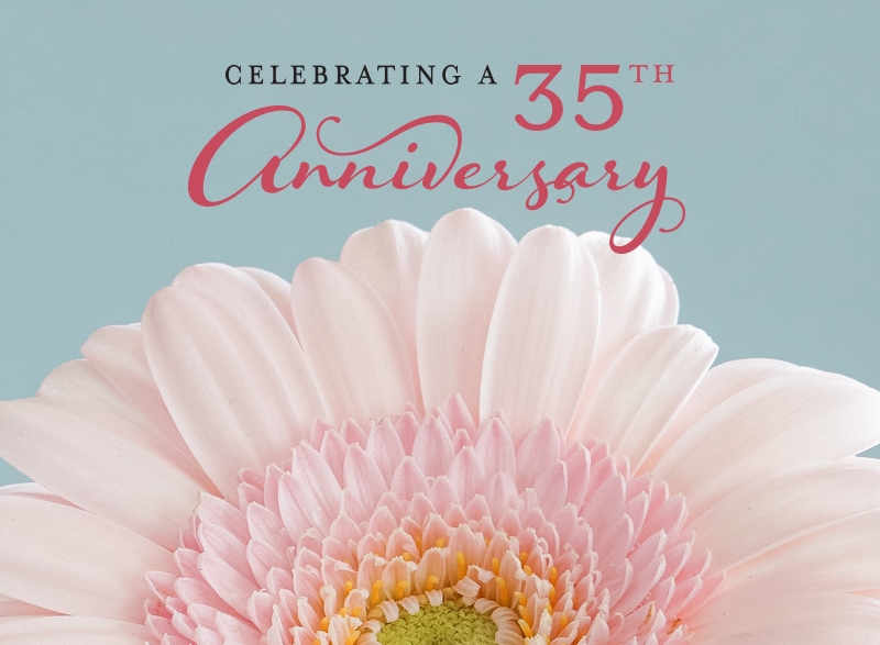
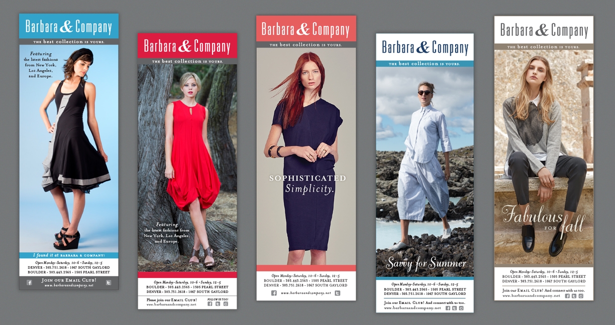
This month, Barbara & Company is celebrating their 35th anniversary. EnZed has created advertising for the women’s clothing boutiques since 2005. Back then, we crafted their tagline “The best collection is yours” during a brand update to position the retailer. Currently, we design monthly advertising in the form of emails, print and digital ads and social media assets, and write blogs promoting new arrivals and a myriad of fundraising events for the local retailer. 

Their secret to longevity? Giving back. Owner Kathy King is a true champion of the community, using her stores to fundraise for nonprofits — from an annual food drive and fashion show fundraisers to specific causes like breast cancer research and aid for Boulder flood victims in 2013.

As a small company ourselves, we enjoy supporting small businesses as their design partner — collaborating to create consistent, affordable marketing that connects with their customers and drive sales. Read the latest blog Hemlines and Timelines and enjoy a look back at our designs for Barbara & Company over the years.

December 13, 2013 - Comments Off on Promotions become products

Promotions become products

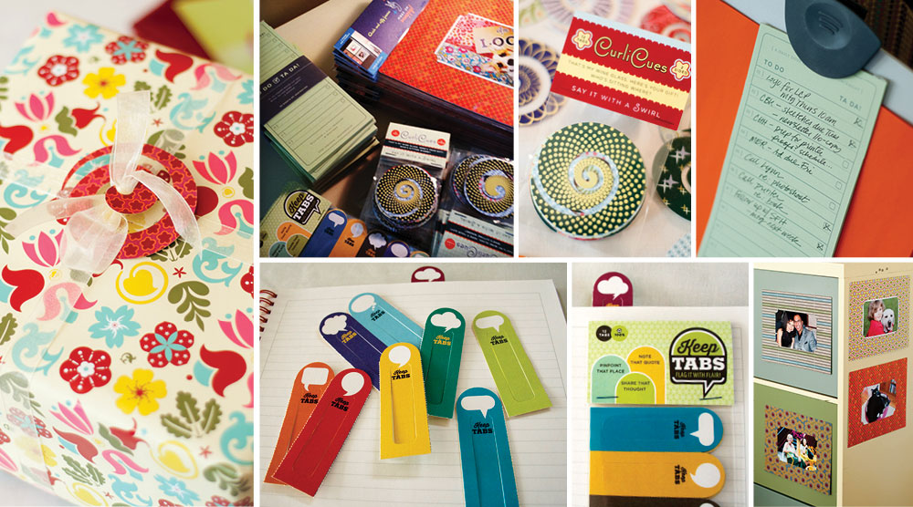
EnZed Design's products sold in I Heart Denver Store in Colorado

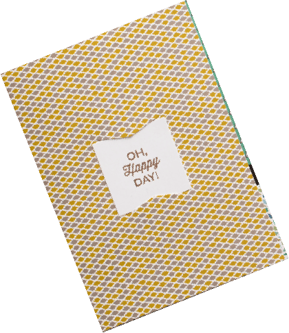
Each year we come up with a clever paper holiday gift for our clients. Now they are available for purchase at the I Heart Denver Store at the Denver Pavilions.

We’re retailing four of our most popular items. Our To Do Ta Da! Notepads offer a little daily dose of inspiration and motivation. CurliCues make gatherings more festive with a simple paper swirl that hooks around a wine stem or ribbon on a package. Make ‘em Snappy frames allow you to take the best pics off your phone and display them on to your fridge. And if getting organized is on your Ta Da list, Keep Tabs are a great start to the new year—a bank of 12 allows you to section your notebook or mark key pages in a recipe book or spicy novel.

Head downtown to the I Heart Denver Store on to get a glimpse of the goods and many other unique creations from other Colorado artists. Our “hostess gifts” and a myriad of Colorado-made keepsakes are great options for far away friends and family. This locally-owned store pays 70% of the retail price directly to the artist, a rare split in the retail world. Very nice.

Have you been naughty or nice?

Not sure? Maybe ask yourself: How many rounds of edits did I make last year? Uh oh. That’s ok, here’s your chance to make nice. We’re finalizing our mailing list for the next EnZed holiday gift. If you're on the list, you'll receive our next creation. Sure beats a lump of coal.

Comment here or send us an email with your address to make sure you’re on the list!

Photos by Lynn Clark Photography and EnZed Design. Printing by Frederic Printing and paper by Neenah Paper.

February 25, 2013 - Comments Off on Meet a Gränd Brand

Meet a Gränd Brand

We recently completed a few projects for Gränd Salon that we are excited about and have been eager to share with you all!

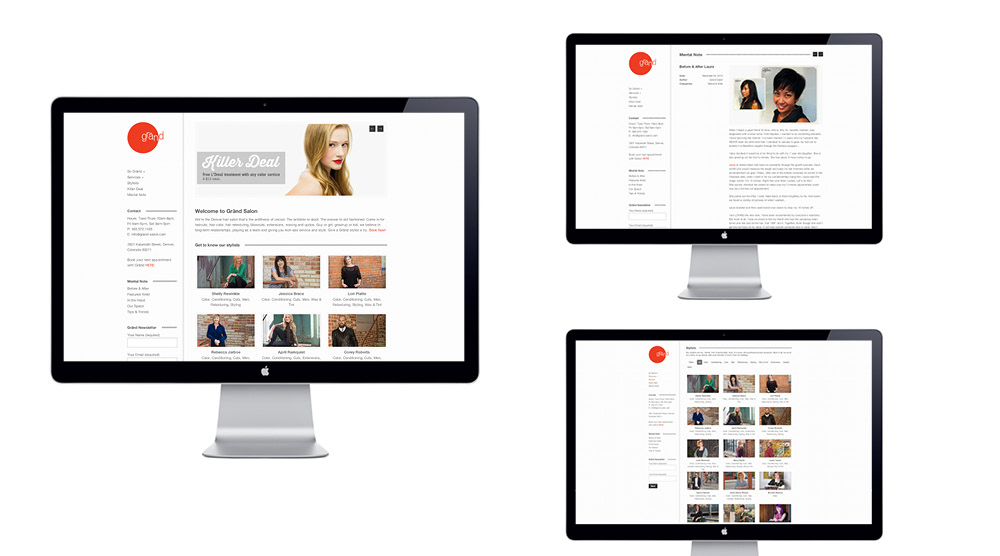
Gränd Salon, owned by Shelly Rewinkle, moved from their LoDo location to a customize space in LoHi on 35th and Kalamath street. The new building was transformed from an old plant warehouse into an industrial yet zen atmosphere with a larger studio for their stylists, more room for retail, plus spa-like amenities — nail services and reclining shampoo stations. Ahhhhhh. We created a fresh new look for their existing brand to better fit their new space,  including a new website, business cards, appointment cards, service cards, and custom emery boards.

Grand Salon Denver, Colorado EnZed Design

Mood board images sourced here

Expanding the brand
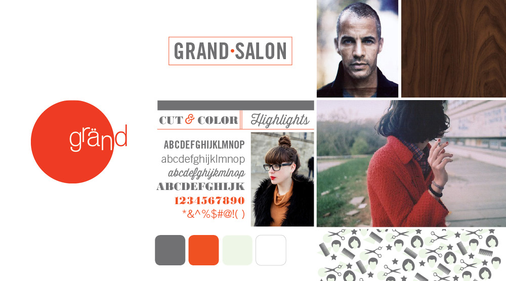
We started out developing a mood board for their brand. We focused on collecting images that were edgy, hip, organic, yet clean and modern to communicate the feel. Then combined the existing red circular logo with new typefaces and natural elements of the interior to establish the look. The mood board set the tone for each element under the brand.

EnZed Design designs Grand Salons website

The website  launched on Jan 11, 2013, opening day at the new studio. We designed, developed and customized the site using a responsive WordPress theme to make it easy for Grand to update it regularly. With the help of Lynn Clark who wrote the copy and used her SEO expertise to optimize it, the site has been an effective tool for announcing the move and introducing the salon to new clients. The site features each stylists with skills listed, enabling clients to search and filter by the service needed and then book an appointment online. Their blog, Mental Note, features salon news and their Killer Deals page offers clients something new to try. The ability to easily change the website allows Gränd to connect their strong Facebook presence and web presence for more effective marketing.

Public Letterpress, EnZed Design, Grand Salon in Denver, Colorado

Making it memorable
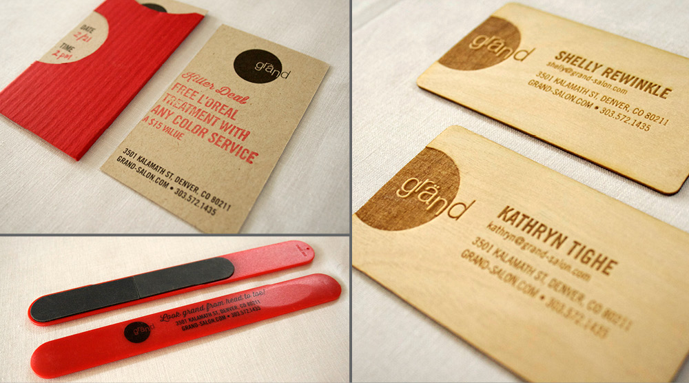
The business cards are made of wood! Thanks to Roger at Public Letterpress, each stylist proudly hands a client a wood veneer laser-cut business card. Not only do they look and feel awesome, they smell so good too! This is a business card you certainly wouldn’t toss. We created a matching Services List that details everything Gränd offers as well.

For the appointment cards we kept things simple and fun, but still unique. The design is printed in black on kraft paper, but we added a custom rubber stamp to feature the current Killer Deal and provided red pencils for the receptionist to jot down information for the client’s upcoming appointment. Two colors without the cost, but all of the creativity.

The emery boards proved to be an effective promotion for Gränd Salon’s big move. Each custom nail file was first handed out to clients at their last appointment in LoDo. It served three purposes: announce the new address, allow a sneak peak at the new look, and promote the new nail services. Bonus – it stays in their bag as a Gränd reminder.

February 12, 2013 - 3 comments

What a Character: Q

Quite the showstopper, the capital Q is a defining character in a typeface. The quality of its curves and swash encapsulates the style of a family of letterforms and offers a place to be a little over the top. Many typophiles have a mental catalog of which typefaces sport the best Qs... and question marks... and ampersands.

Quenching your curiosity: Bembo and Trajan have classic Qs with restrained elegance and flow. Mrs. Eaves, a contemporary serif, quarantines balance within its curves. For the less-is-more camp, you can’t ignore the quietude of the Gotham sans serif Q. No fuss, no muss. Ding! It’s ready.

Quintessentially, Q is the perpetual drama queen…not merely an O with ornament. Q’s unique qualities can make it the life of the party. It carries more subtlety than the arresting X or zany Z. Never lacking for companionship, Q does everything with a flourish and travels with an entourage. A loyal companion, the ubiquitous lowercase U is as unassuming as Q is demanding. After all, Q aspires to be uppercase most of the time and can be spotted seeking drop-cap status, though it rarely attains it. It’s fated to be typecast as a character actor.

Quirky to dramatic, Q can make or break a game of Scrabble. Carrying the highest value of all the tiles —10 points—draw one early on and you’ll triple-word-score your way to victory. Draw one as the tiles dwindle and you’re scavenging for a well-placed I. Breathe deeply and let the Qi flow.

Queerly perplexing is its appearance in the scripts. Taken from old-school cursive handwriting, it appears to be a numeral 2 with flair. Edwardian Script recalls the humble homemade form in a prideful display. The Amish might cringe a little, but you can see the bridge it creates to the contemporary, swashbuckling serif styles.

Quasi-essential? Quiet the thought. And thank Q for evolving.

Credits & Typefaces: Top (L-R): Mea Culpa/Vintage Q/Reina 36 Pro/Giotto/Q Pillow Bottom (L-R): Jessica Hische, Daily Drop Cap/Vintage Letterpress Type/EnZed Design-Emily/Serif Swash/Quick Fox


If U have been quaking to create a Q too, send it R way and we'll post a few!

Check out more of our favorite Qs on Pinterest!


February 12, 2013 - Comments Off on Fine Fellows

Fine Fellows

This June, AIGA Colorado is honoring two of our brightest and boldest creatives to be recipients of the prestigious AIGA Fellow Award. The Fellow award program is a means of recognizing designers who have made a significant contribution to raising the standards of excellence in practice and conduct within their local or regional design community as well as in their local AIGA chapter. The areas of education, writing, leadership and reputation, as well as the practice of design are given equal consideration in measuring significant contribution. I’ve been honored with the request to design the gala event invitation.

At the 2011 Fellow awards, I had the opportunity to make the introductions for one of my favorite people—a fine Fellow she is. I would like to share with you a little about my wonderful friend and colleague, Marian Halliday.

AIGA Fellow Award 2011: Marian Halliday
Star Date: June 2011 — Introduction Speech

Huh-looooooo!

Good evening. I’m pleased to have the honor to introduce one of my favorite people in the graphic design industry, Marian Halliday. Or as some of you may know her affectionately as Marian Jolly Halliday, Maid Marian, Marian, Marian the Paper Librarian, or even... Marian the Barbarian!
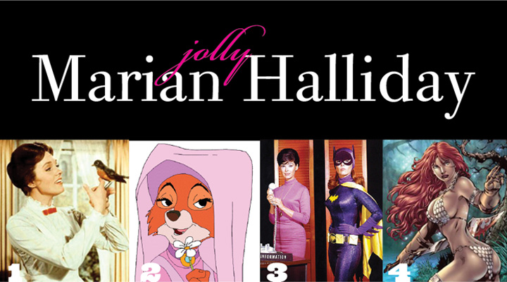
AIGA Colorado Fellow Marian Halliday paper expert Sprint Press Denver EnZed Design

You maybe wondering why Marian is being symbolized by animated stills. Actually, it’s only fitting because Marian’s entry into the design world was first as an illustrator for animator Paul Fierlinger in Philadelphia. During her two years there, she hand drew cells for animations featured on The Children’s Television Network. Yep, Sesame Street! Paul’s most memorable work from that time was Teeny Little Super Guy.

Marian Halliday started her career as a designer in the publishing world as a paste-up artist at the newspaper Canyon Courier. And eventually she worked as a designer for Macnimera Publishing for eight years where she design collateral for quintessential Colorado clients, like National Cattleman’s Association.

Although her career started in Philly, her love affair with design, designers (one in particular) and AIGA grew when she came to Colorado. As she merged families, she also corralled her passions into something much more far reaching.
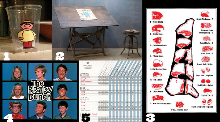
AIGA Colorado Fellow Marian Halliday Sprint Press EnZed Design Denver

Fastforward to 2011. On a particularly sunny day this spring, Marian came by and shared with me that she had been helping Bob Taylor’s daughter clean out his office. Given Bob’s love of this creative community, she wanted to be certain nothing of historic importance was lost. But when she said, “You’ll never guess what I found…,” I knew there was a surprise coming with a story to match.

I met Marian in 1993, when she had moved on to paper. I was new to Denver and had just four years of design under my belt. We bonded immediately over the gorgeous textures, the newest colors, the heaviest weights — she knew them all. And best of all, she could read that scary spec chart behind the decks.

Along those lines, let’s just take a moment to review Marian’s career history with this handy, and much simpler, timeline. On left is the Archaic Eon circa 1972 to 1989 where she worked as an illustrator and designer — represented by the T-square.

During this period, it was often noted that Marian could draw a straight line, a skill many clients covet to this day.  Then we enter the eventful Paperozoic Eon. It starts with the 5-year Zellerback period and is followed by the more substantial Unisource Period that lasted through 2009. Note the correlation of the founding of the local AIGA chapter in 1989 and the inaugural Heart Art event, in 1994.
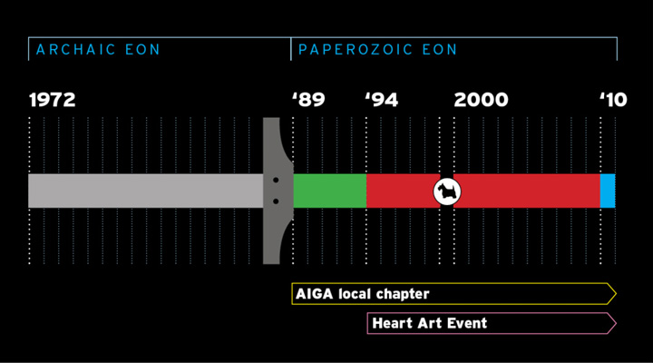
AIGA Colorado Fellow Marian Halliday Sprint Press EnZed Design Denver

If you look very closely, you’ll notice a tiny blip during the 1999-2000 millennium called the Steinian Period, or more commonly known as the Scottie Dog in the Lobby Event. Finally, Marian landed at Johnson Printing where she now functions as their paper librarian by day, and Bat Girl by night. [Marian is now with Sprint Press.]

Woven throughout this enduring career has always been AIGA.

I served with Marian on the board in the mid to late 1990s. A few years prior, the board had conceived Heart Art. A beautiful event at chocolatier Coco Loco, it had captured Marian’s heart and she made it her priority to run it. And she boy did she run with it.

Heart Art became the single most consistent event held by AIGA Colorado. Moreover, it is a significant fundraiser for the association, as well as the community. That longevity and its great return is due to Marian's passion, hard work and ability to recruit a great team of volunteers to make it happen. She's a practical gal, understanding the time and budget limitations, but still managing to turn out great attendance every year. Not to mention, gather the artwork for auction, from our local deadline-stretching designers.

When I see Marian in action on Heart Art, I think of Dick Van Dyke's one-man band in Mary Poppins. Quite a physical feat, with a dash of comic genius. Marian has served on the AIGA Colorado Board, it’s executive committee and as Advisor to the Board. She is always ready to lend a helping hand. She remains involved in many events, as encourager, instigator, organizer, sounding board, and welcoming face.
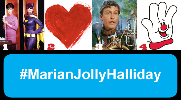
AIGA Colorado Fellow Marian Halliday Sprint Press EnZed Design Denver

In 2010, she was instrumental in the advancement and renaming of The Robert Taylor AIGA Scholarship. Earlier this evening, you heard from Robert’s daughter, Jenny, about this wonderful resource. Beyond AIGA, Marian loves being it touch with the community. She's often called upon as a recruiter by creative principals or a head hunter by job seekers. She's like a walking Twitter feed.

One hour with Marian and I feel connected. She's how I keep in touch with what's really going on in printing, design and advertising firms, who's working where, and what great account just landed on whose desk. So, at lunch, I got all caught up. Caught up in what a remarkably valuable asset Marian Halliday is to AIGA Colorado.

The momentum builder and worker bee. The bringer of industry news, paper promos, and now printing technologies, too. The caretaker of the past, so we don't forget how we got here. I think when Bob left us, he passed that well-carried torch to Marian.

So, I thought for a good while before responding to her you’ll never guess teaser. What would surprise me in Bob's dusty collection of design tools? No, those are probably still in my basement. We need to go back even further...
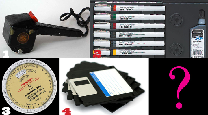
AIGA Colorado Fellow Marian Halliday Sprint Press EnZed Design Denver

“Not a clue,” I finally said. “What was it?"
Marian laughed:  “A 300-sheet pad of Rubylith!”

Certainly one for the archives.
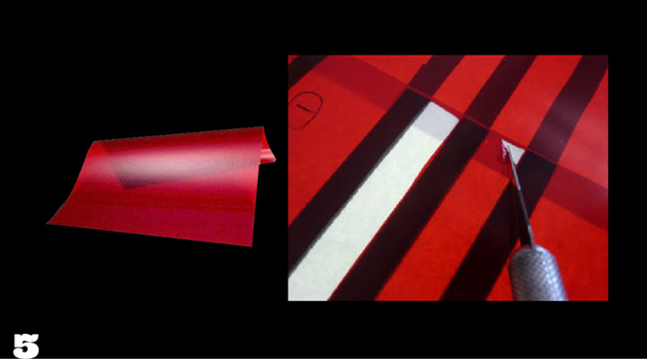
AIGA Colorado Fellow Marian Halliday Sprint Press EnZed Design Denver

Thank you Marian. From all of us. And especially from all of the volunteers and members, past and present, who make AIGA Colorado a lively and lovely organization.

Ta! Ta!

Credits: Mary Poppins, Maid Marian, Walt Disney Studios; Bat Girl, DC Comics; Red Sonia, Marvel Comics; Side of Beef, Ask The Meat Man; Brady Bunch, ABC. The imagery collected here was found via Google nearly two years ago. If an image is yours, please contact me and I will add a credit and a link.
October 23, 2012 - 1 comment.

New and Improved: C3 Magazine

Over the years, EnZed has been asked to redesign a wide range of publications. Some simply have been tired—dated in appearance. Others have looked for a new face to improve readership by communicating more clearly.

C3 Magazine is a strong case of the second.

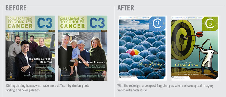
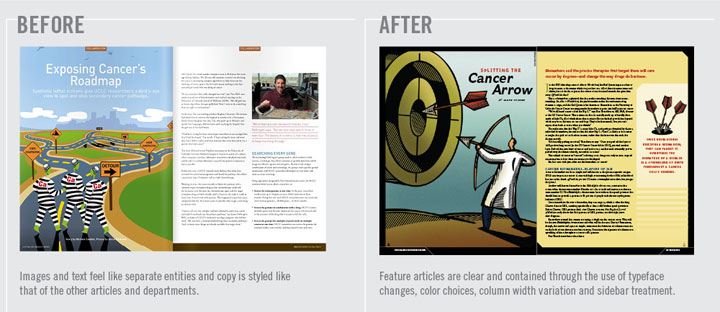
In its original format, C3 Magazine—The University of Colorado Cancer Center’s donor publication—felt a little heavy. There were many colored backgrounds and solid copy columns dominated. The Cancer Center clearly had  great stories to share, but  they needed to work harder if they were to captivate additional donors.

When analyzing the existing design, we began by first focused on how to improve the way readers navigated the information. One of the parameters set was to keep the current amount of content within the same page count and size. So we became the “What Not To Wear” style experts—hiding bulges and enhancing best attributes. Let the make over begin!


C3 Magazine EnZed Design Denver Colorado


OUR STATED OBJECTIVES:

1. Increase reader interest

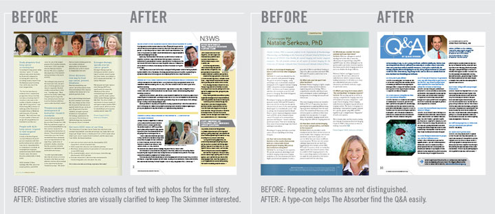
  • Capture the SKIMMER. Short subheads and easy-to-read sidebars communicate more messages than headlines alone, enticing them in.
  • Convert the SELECTIVE READER. The speed reader will have time to read more articles if they are “blocked” into chunks that are quickly absorbed.
  • Activate the ABSORBER. Your biggest fan, the Absorber, is rewarded with visual cues that indicate sections more clearly, so they can go to their favorite areas first. They love links too. Perhaps a primary link plus two or three related topic links for bigger articles would give the absorber more to share with colleagues.

C3 Magazine EnZed Design Denver Colorado


2. Lighten the load

  • Reduce the appearance of copy by 20%. This might mean reducing word count. It can also be done by arranging content to be easily “blocked” into sidebars. Keeping subheads short and replacing line breaks with indents for new paragraphs can make room for white space without compromising content.
  • Increase white space with small layout changes. Icons or type-cons help with navigation and differentiate sections to add visual interest within a small space. A “bouncing bottom” can reduce a wall-to-wall copy appearance and is very effective at creating white space within a three column grid.

3. Expand the brand

  • Add variety to visuals. Rectangular photos of people are currently the main visual. While this can make the document feel friendly, it can also become repetitive. Add variety by changing sizes more, adding icons, type-cons, softer shapes, gradating color blocks, and stock illustration for broader concepts. Uniquely cropped head shots add variety too.
  • Use color to help guide the reader and differentiate sections. A primary color palette plus the addition of a color that is dedicated to a feature or regular section can create a unified appearance while keeping things interesting.
  • Headlines don’t have to be at the top. They can be in the middle of the page if there’s a strong introduction and a clear design to guide the reader’s eye. Chunk smaller stories together on a page with varying column spans.

C3 Magazine Redesign EnZed Design Denver Colorado


The results were immediate. Right after C3 hit mailboxes, positive feedback from readers came streaming in. The CUCC communications team received many compliments on and no disconnect with the new design.

We are currently working on the third issue. The Fall 2011 and Spring 2012 issues can be viewed in their entirety online.