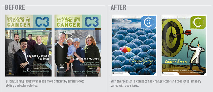
Over the years, EnZed has been asked to redesign a wide range of publications. Some simply have been tired—dated in appearance. Others have looked for a new face to improve readership by communicating more clearly.
C3 Magazine is a strong case of the second.
In its original format, C3 Magazine—The University of Colorado Cancer Center’s donor publication—felt a little heavy. There were many colored backgrounds and solid copy columns dominated. The Cancer Center clearly had great stories to share, but they needed to work harder if they were to captivate additional donors.
When analyzing the existing design, we began by first focused on how to improve the way readers navigated the information. One of the parameters set was to keep the current amount of content within the same page count and size. So we became the “What Not To Wear” style experts—hiding bulges and enhancing best attributes. Let the make over begin!
OUR STATED OBJECTIVES:
1. Increase reader interest
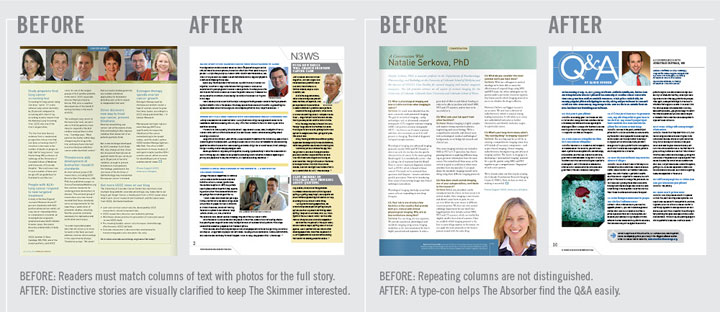
- Capture the SKIMMER. Short subheads and easy-to-read sidebars communicate more messages than headlines alone, enticing them in.
- Convert the SELECTIVE READER. The speed reader will have time to read more articles if they are “blocked” into chunks that are quickly absorbed.
- Activate the ABSORBER. Your biggest fan, the Absorber, is rewarded with visual cues that indicate sections more clearly, so they can go to their favorite areas first. They love links too. Perhaps a primary link plus two or three related topic links for bigger articles would give the absorber more to share with colleagues.
2. Lighten the load
- Reduce the appearance of copy by 20%. This might mean reducing word count. It can also be done by arranging content to be easily “blocked” into sidebars. Keeping subheads short and replacing line breaks with indents for new paragraphs can make room for white space without compromising content.
- Increase white space with small layout changes. Icons or type-cons help with navigation and differentiate sections to add visual interest within a small space. A “bouncing bottom” can reduce a wall-to-wall copy appearance and is very effective at creating white space within a three column grid.
3. Expand the brand
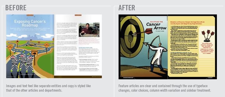
- Add variety to visuals. Rectangular photos of people are currently the main visual. While this can make the document feel friendly, it can also become repetitive. Add variety by changing sizes more, adding icons, type-cons, softer shapes, gradating color blocks, and stock illustration for broader concepts. Uniquely cropped head shots add variety too.
- Use color to help guide the reader and differentiate sections. A primary color palette plus the addition of a color that is dedicated to a feature or regular section can create a unified appearance while keeping things interesting.
- Headlines don’t have to be at the top. They can be in the middle of the page if there’s a strong introduction and a clear design to guide the reader’s eye. Chunk smaller stories together on a page with varying column spans.
The results were immediate. Right after C3 hit mailboxes, positive feedback from readers came streaming in. The CUCC communications team received many compliments on and no disconnect with the new design.
We are currently working on the third issue. The Fall 2011 and Spring 2012 issues can be viewed in their entirety online.
Published by: Helen in EnSights, NewZ
Tags: C3, clients, CUCC, EnZed Design, graphic design, magazine, print design, publications, UC Boulder, University of Colorado


mr design
April 19, 2013 at 3:53 pm
Excellent job. Thumbs up!
Comments are closed.