All Posts in clients

June 20, 2017 - Comments Off on Tennis, Anyone?

Tennis, Anyone?

With Colorado’s tennis league season in full swing and Wimbledon approaching on July 3, there’s no better time to celebrate our favorite sport here at EnZed Design.

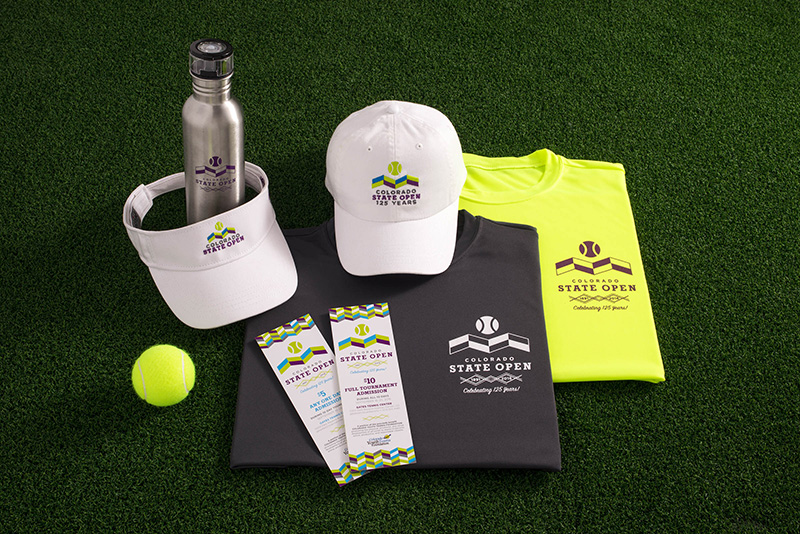
We’re hard at work on a brand refresh for the 2017 Colorado State Open, our state’s most prestigious and well-attended tennis tournament. (We had the pleasure of rebranding the tournament entirely in 2016, which you can see here.) Adding animation to our repertoire, we’ve created a video teaser to bring the dynamic motion of tennis to the tournament’s vibrant brand. Watch the video below.

Mark your calendar for September 15–24, 2017 to catch the action and see our work on display. In the meantime, check out another tennis branding project, TennisAdvisor, whose logo represents the converging of coaching, the game, and the junior player.

May 11, 2017 - Comments Off on Birds of a Feather

Birds of a Feather

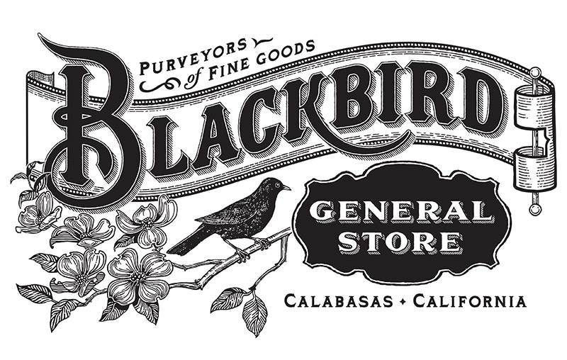
Blackbird General Store logo

We were fortunate to meet Sharon Repass, a creative mind looking to realize her dream of owning a retail store. She’d just found the perfect spot for Blackbird General Store in Calabasas, California, when she found us. We created the logo, packaging, gift boxes, and signage for her fall launch. The project caught the eye of Sabine Lenz, Paper Queen and Founder of PaperSpecs.com. We were all aflutter when she chose to feature it in her Inspiration column. View the PaperSpecs video and check out the full project in our Branding portfolio.

December 20, 2014 - Comments Off on Our 2014 highlight? An 1863 experience.

Our 2014 highlight? An 1863 experience.

EnZed Design FCC Services Gettysburg Leadership Experience Helen Young

When the innovative marketing director at FCC Services, first spoke with us about rebranding their Gettysburg Leadership Experience, we were intrigued. How often does a design group like EnZed have the opportunity to develop a fresh identity for a program merging 19th Century lessons and 21st Century leadership?  The result, I’m delighted to say, has garnered enough participant interest to fill all 2015 Experience sessions and cause more to be slated. (It’s also led to our being asked to develop special materials to help FCCS celebrate their 40th anniversary and re-energize their conference offerings.)

In brief, The Gettysburg Experience brings corporate executives to the Gettysburg battlefield for an intensive exploration of decisions made during that nation-changing three-day conflict. The goal is to examine what happened at that Civil War turning point and translate it into practical leadership strategies to guide one’s personal and corporate path forward.

EnZed’s initial scope of work included a new logo, program graphic design, marketing collateral and on-site materials for participants to use during their Gettysburg “boots on the ground” journey. Moreover, our copywriter Carla Carwile was to provide web text for project co-partner, Rabble + Rouser.

But something happened on the way to final product.  Our objectivity led to questions that sparked a full-program reassessment by the client. Modules were updated, options expanded and activities aligned. The outcome is winning praise as well as participation. The FCCS board just pronounced it exceptional and a major step forward for the organization.

EnZed Design FCC Services Gettysburg Leadership Experience Helen Young

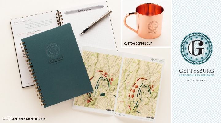
Shown here are:

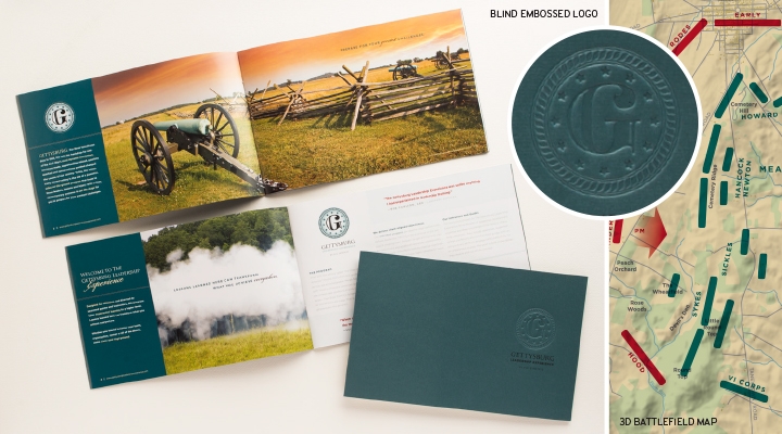
• The brochure encouraging enrollment

• The field guide with customized map used by participants while at Gettysburg

• The copper cup memento inscribed with the program logo


This multi-layered project succeeded because of true teamwork. A special thanks to:

• Rob Barnes of Vintage Pressworks for his custom iNPEND notebooks and his Civil War expertise

• Matt Luckwitz of GrafPort for his 3D battle-plan map tracking the three-day battle

Frederic Printing for their signature excellence

Annette Slade for the photo appearing here and the finished product images on our EnZed website


…and most important, to the FCCS team. Thank you for an extraordinary opportunity.


 HAPPY 2015, EVERYONE!

And we'll take a cup o' kindness yet, for auld lang syne.”

February 25, 2013 - Comments Off on Meet a Gränd Brand

Meet a Gränd Brand

We recently completed a few projects for Gränd Salon that we are excited about and have been eager to share with you all!

Gränd Salon, owned by Shelly Rewinkle, moved from their LoDo location to a customize space in LoHi on 35th and Kalamath street. The new building was transformed from an old plant warehouse into an industrial yet zen atmosphere with a larger studio for their stylists, more room for retail, plus spa-like amenities — nail services and reclining shampoo stations. Ahhhhhh. We created a fresh new look for their existing brand to better fit their new space,  including a new website, business cards, appointment cards, service cards, and custom emery boards.
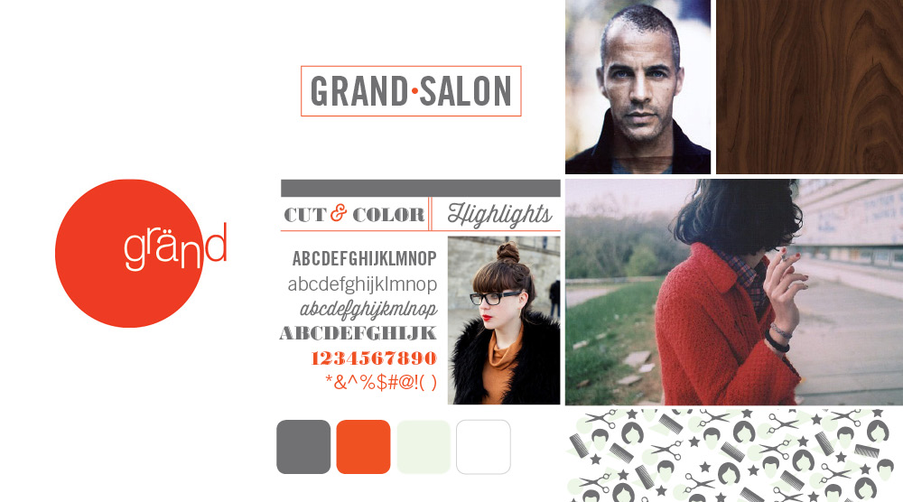
Grand Salon Denver, Colorado EnZed Design

Mood board images sourced here

Expanding the brand
We started out developing a mood board for their brand. We focused on collecting images that were edgy, hip, organic, yet clean and modern to communicate the feel. Then combined the existing red circular logo with new typefaces and natural elements of the interior to establish the look. The mood board set the tone for each element under the brand.
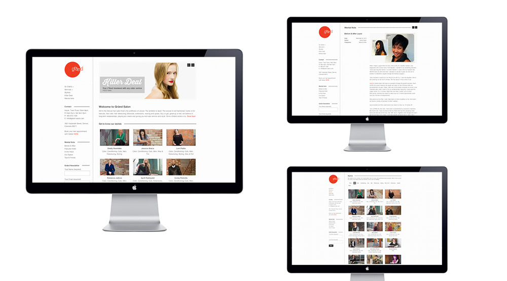
EnZed Design designs Grand Salons website

The website  launched on Jan 11, 2013, opening day at the new studio. We designed, developed and customized the site using a responsive WordPress theme to make it easy for Grand to update it regularly. With the help of Lynn Clark who wrote the copy and used her SEO expertise to optimize it, the site has been an effective tool for announcing the move and introducing the salon to new clients. The site features each stylists with skills listed, enabling clients to search and filter by the service needed and then book an appointment online. Their blog, Mental Note, features salon news and their Killer Deals page offers clients something new to try. The ability to easily change the website allows Gränd to connect their strong Facebook presence and web presence for more effective marketing.
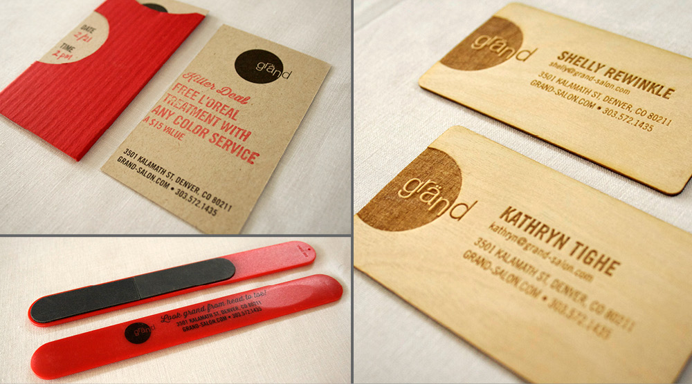
Public Letterpress, EnZed Design, Grand Salon in Denver, Colorado

Making it memorable
The business cards are made of wood! Thanks to Roger at Public Letterpress, each stylist proudly hands a client a wood veneer laser-cut business card. Not only do they look and feel awesome, they smell so good too! This is a business card you certainly wouldn’t toss. We created a matching Services List that details everything Gränd offers as well.

For the appointment cards we kept things simple and fun, but still unique. The design is printed in black on kraft paper, but we added a custom rubber stamp to feature the current Killer Deal and provided red pencils for the receptionist to jot down information for the client’s upcoming appointment. Two colors without the cost, but all of the creativity.

The emery boards proved to be an effective promotion for Gränd Salon’s big move. Each custom nail file was first handed out to clients at their last appointment in LoDo. It served three purposes: announce the new address, allow a sneak peak at the new look, and promote the new nail services. Bonus – it stays in their bag as a Gränd reminder.
October 23, 2012 - 1 comment.

New and Improved: C3 Magazine

Over the years, EnZed has been asked to redesign a wide range of publications. Some simply have been tired—dated in appearance. Others have looked for a new face to improve readership by communicating more clearly.

C3 Magazine is a strong case of the second.

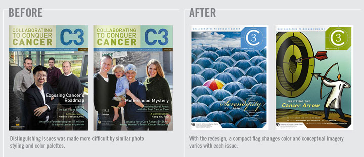
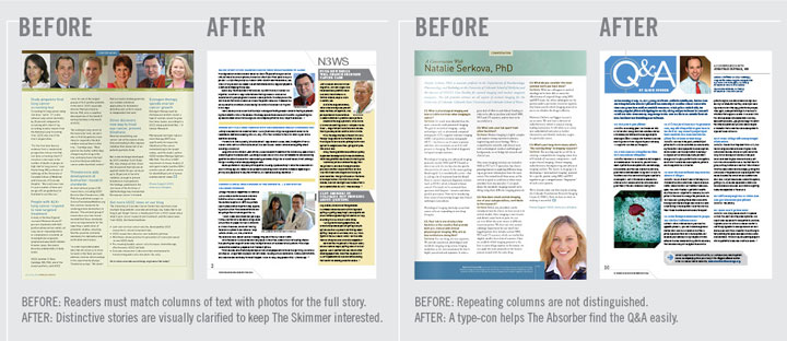
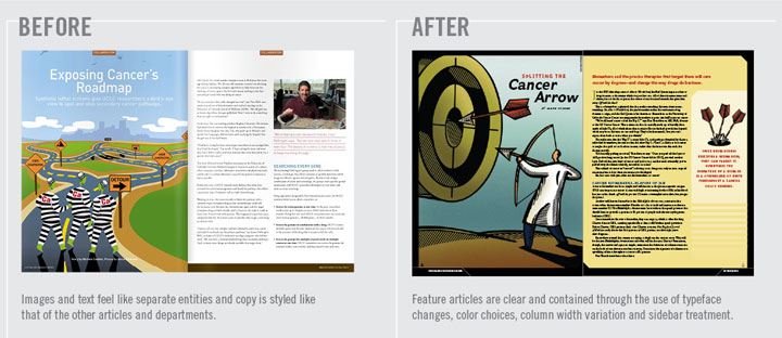
In its original format, C3 Magazine—The University of Colorado Cancer Center’s donor publication—felt a little heavy. There were many colored backgrounds and solid copy columns dominated. The Cancer Center clearly had  great stories to share, but  they needed to work harder if they were to captivate additional donors.

When analyzing the existing design, we began by first focused on how to improve the way readers navigated the information. One of the parameters set was to keep the current amount of content within the same page count and size. So we became the “What Not To Wear” style experts—hiding bulges and enhancing best attributes. Let the make over begin!


C3 Magazine EnZed Design Denver Colorado


OUR STATED OBJECTIVES:

1. Increase reader interest

  • Capture the SKIMMER. Short subheads and easy-to-read sidebars communicate more messages than headlines alone, enticing them in.
  • Convert the SELECTIVE READER. The speed reader will have time to read more articles if they are “blocked” into chunks that are quickly absorbed.
  • Activate the ABSORBER. Your biggest fan, the Absorber, is rewarded with visual cues that indicate sections more clearly, so they can go to their favorite areas first. They love links too. Perhaps a primary link plus two or three related topic links for bigger articles would give the absorber more to share with colleagues.

C3 Magazine EnZed Design Denver Colorado


2. Lighten the load

  • Reduce the appearance of copy by 20%. This might mean reducing word count. It can also be done by arranging content to be easily “blocked” into sidebars. Keeping subheads short and replacing line breaks with indents for new paragraphs can make room for white space without compromising content.
  • Increase white space with small layout changes. Icons or type-cons help with navigation and differentiate sections to add visual interest within a small space. A “bouncing bottom” can reduce a wall-to-wall copy appearance and is very effective at creating white space within a three column grid.

3. Expand the brand

  • Add variety to visuals. Rectangular photos of people are currently the main visual. While this can make the document feel friendly, it can also become repetitive. Add variety by changing sizes more, adding icons, type-cons, softer shapes, gradating color blocks, and stock illustration for broader concepts. Uniquely cropped head shots add variety too.
  • Use color to help guide the reader and differentiate sections. A primary color palette plus the addition of a color that is dedicated to a feature or regular section can create a unified appearance while keeping things interesting.
  • Headlines don’t have to be at the top. They can be in the middle of the page if there’s a strong introduction and a clear design to guide the reader’s eye. Chunk smaller stories together on a page with varying column spans.

C3 Magazine Redesign EnZed Design Denver Colorado


The results were immediate. Right after C3 hit mailboxes, positive feedback from readers came streaming in. The CUCC communications team received many compliments on and no disconnect with the new design.

We are currently working on the third issue. The Fall 2011 and Spring 2012 issues can be viewed in their entirety online.