All Posts in EnSights

May 17, 2021 - Comments Off on Branding and the Power of Pattern

Branding and the Power of Pattern

The most memorable brands do not live by logos, alone. Instead, they leverage their well-designed mark in every possible manner. The conscious, consistent use of fonts, colors, tone and positioning adds dimension. Some even encompass scent and sound to elevate distinction.

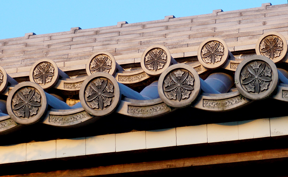
One of the simplest ways to mark territory is through the development of a custom brand pattern. Possible applications range from a subtle background for an engaging website to a star-powered position on a best-selling product. 

We create custom patterns for clients by using elements of their logo in proprietary designs. The objective is to add texture and depth across multiple media for optimal visibility. Branding demands reinforcement, and this is one more way to achieve it.

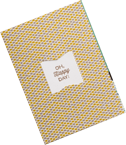
Here are examples of logos we designed and their custom companion patterns. 

The Power of Process

When I create a custom pattern for a brand, I start by looking at the elements and shapes in the logo. Whether it is a new logo designed by my firm or an established mark, we address it the same way — identify the most significant visuals and build on them. We also consider how to create a seamless repeat with these elements. 

Repeats can be horizontal, vertical, diagonal, block or offset (partial drop or brick). Certain shapes and scales lend themselves to different repeat styles. For example, round shapes half-drop well in an offset repeat because the shapes fit into each other snuggly. Asymmetrical core shapes require additional elements around them to create a block repeat. It takes some experimenting to eliminate striping or gaps for a clean, seamless repeat, especially in designs that need to “read” in all directions (not just up and down, as on wallpaper).

Brand patterns must apply well on myriad surfaces — electronic media; printed small or large on paper, fabric and other substrates; and often rendered flat or dimensionally (e.g. routed into metal). Because these factors can influence the motif’s complexity and color palette, it’s best to know where the pattern will be used before beginning design. Once these specifications are set, it’s exciting to see the variations that emerge. Often, more than one design hits the mark, resulting in a suite of brand patterns that can serve as a library for the client over time.

The POW! of Results

Here are some examples of designs we’ve created that make it easy to see how the patterns relate to their brands. 

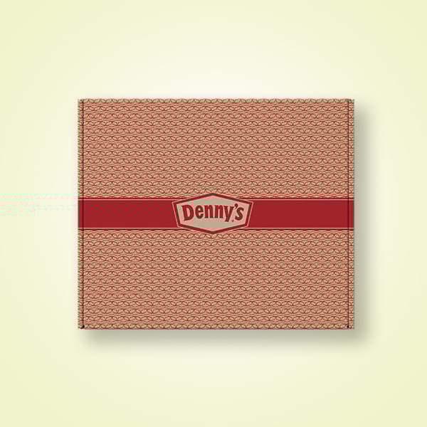
  • Denny’s to-go boxes — Their signature French diamond was overlapped and rotated to create a geometric pattern that also looks like a box motif. 
  • Blackbird General Store tissue paper — The illustration of the bird and branch in the logo was reworked as a toile pattern, a custom take on traditional fabric that reinforced the nature of the brand.
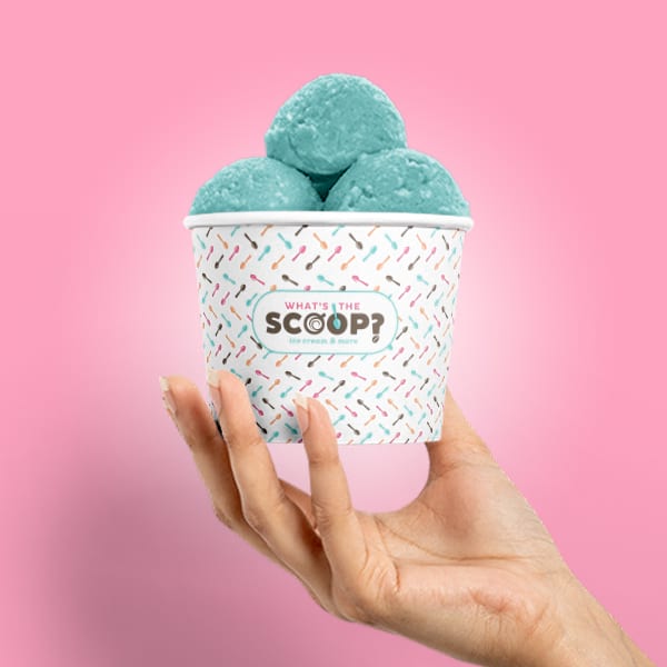
  • What’s the Scoop? cups — The spoon from the “O” is repeated in a simple linear pattern that feels like sprinkles on ice cream. 
  • FCCS conference folders — The conference logo shape repeats in a fine-lined geometric micro-pattern, acting as a texture (further enhanced with gloss and dull varnishes).
  • LiveWell Colorado branding — The colorful burst created the perfect any-direction pattern for branding a variety of communications.
  • Children’s Circle of Care event — The heart of the logo combines with icons from the host hospital to create a pattern to brand the event through a custom tie (fabric), invitations (paper), water bottle (plastic) and more.

Enrich your brand with a custom pattern that creates instant recognition wherever it goes. 

And it can go virtually everywhere.
Contact Helen to get started.

June 13, 2018 - Comments Off on Patterns in Culture: Japan

Patterns in Culture: Japan

My love for travel started before I was two years old, when my parents flew me from New Zealand to Chicago, the beginning of what became their 30 year adventure in the United States. Each summer, we traveled. My brother and I made a nest in the back of the station wagon and we’d motor around the vast countryside of America or we’d hop on a plane to vacation overseas, taking advantage of my father’s light summer workload to see the world. Even as a child, I took in new cultures through small details and remembered each state or country by their textures, textiles, buildings and gelato flavors.

Today I see patterns everywhere I go, whether at home in Denver or in foreign curiosities. I've learned that each country reveals itself through the people’s expression of art, pattern and design. What is rendered are revered items of daily life or spiritual aspiration. Through my adventures, I’ve discovered that culture is not contained in a museum, but open to all and constantly evolving — simply walk, wander and take it in.

Patterned Roof in Kyoto Japan EnZed Design Helen Young

Japan

On my recent trips to Tokyo and Kyoto, I found objects rich in color and variety of pattern. The Japanese attention to detail is highly symbolic of their respect for others and their surroundings. Their connection to the Earth and its energy is part of their spirituality and expressed via the vermilion, gold and colorful patterns on their Shinto shrines and Buddhist temples. There’s a rhythm to their spaces, creating visual patterns in three dimensions. Most of the printed patterns you find on papers and fabrics are representations of nature — flora, fauna, water and sky. Many are symbols associated with spirituality, luck, abundance and good fortune. This Kiriko clothing company article shows the most prevalent patterns, explaining their names, symbolism and origin.

Azaleas and Gates in Tokyo Japan EnZed Design Helen Young

The Japanese mix patterns and color expertly, which is especially notable in the multiple fabrics layered in their kimonos. You also see this in their fine art. They combine patterned papers as borders or mattes on hanging paintings and within hinges and borders on painted screens. Patterns are inlaid on boxes and painted on ceramics. Their combinations of pattern scale and object shapes within them is deft and often unexpected. Most of us are familiar with origami paper collections that fan out a gorgeous mix of patterns. The variety of these origami packs in Japan is dizzying. When I visited the iconic stationery shop Itoya in Ginza, Tokyo, I spent nearly 2 hours combing through 12 floors of paper, washi tape, journals, cards, bookmarks, pens, and shaped sticky notes. My Pinterest board on Japanese Design has an array of eyecandy featuring items with innovative simplicity or intricate decoration — all with a deliberately delicate touch.

Shoes in Kyoto Japan EnZed Design Helen Young Patterns

What’s particularly interesting to me about Japanese pattern is the motifs are ancient yet very contemporary. This mix is evident everywhere in their culture and takes many forms. In modern Tokyo, it’s subway riders with heads bowed absorbed in their phones balanced by their custom of bowing in greeting. In Kyoto, it’s a hunger for shopping high-fashion brands balanced by young people renting kimonos and queuing for tea ceremonies. (Side note: The shoe selections in Japanese department stores are on a scale I’ve not encountered before. Wowza.)

Kimonos Kyoto Manhole Cover Tokyo Japan EnZed Design Helen Young

Harmony and beauty come from this knack for balance. A quality I love about the Japanese people is their utmost respect for one another and their surroundings. You’d be hard pressed to encounter brash personalities or see careless littering. At the end of a rainy day, Tokyo’s subway train floor was shiny and spotless. The city’s manhole covers are famously shared on Instagram. Consumerism is high and space is precious, yet patience and civility underpin the culture. As the world capital of cute, with a love of animal ears on everything and hats on cats, I surmise that people strive to find small joys in many places or moments, especially in Tokyo, one of the world’s most densely populated cities. I’ll have to explore the country more to test that theory. Until then, enjoy these 20 photos + 20 haikus expressing my impressions of Japan (3 minute video). Arigato.

October 23, 2012 - 1 comment.

New and Improved: C3 Magazine

Over the years, EnZed has been asked to redesign a wide range of publications. Some simply have been tired—dated in appearance. Others have looked for a new face to improve readership by communicating more clearly.

C3 Magazine is a strong case of the second.

In its original format, C3 Magazine—The University of Colorado Cancer Center’s donor publication—felt a little heavy. There were many colored backgrounds and solid copy columns dominated. The Cancer Center clearly had  great stories to share, but  they needed to work harder if they were to captivate additional donors.

When analyzing the existing design, we began by first focused on how to improve the way readers navigated the information. One of the parameters set was to keep the current amount of content within the same page count and size. So we became the “What Not To Wear” style experts—hiding bulges and enhancing best attributes. Let the make over begin!


C3 Magazine EnZed Design Denver Colorado


OUR STATED OBJECTIVES:

1. Increase reader interest

  • Capture the SKIMMER. Short subheads and easy-to-read sidebars communicate more messages than headlines alone, enticing them in.
  • Convert the SELECTIVE READER. The speed reader will have time to read more articles if they are “blocked” into chunks that are quickly absorbed.
  • Activate the ABSORBER. Your biggest fan, the Absorber, is rewarded with visual cues that indicate sections more clearly, so they can go to their favorite areas first. They love links too. Perhaps a primary link plus two or three related topic links for bigger articles would give the absorber more to share with colleagues.

C3 Magazine EnZed Design Denver Colorado


2. Lighten the load

  • Reduce the appearance of copy by 20%. This might mean reducing word count. It can also be done by arranging content to be easily “blocked” into sidebars. Keeping subheads short and replacing line breaks with indents for new paragraphs can make room for white space without compromising content.
  • Increase white space with small layout changes. Icons or type-cons help with navigation and differentiate sections to add visual interest within a small space. A “bouncing bottom” can reduce a wall-to-wall copy appearance and is very effective at creating white space within a three column grid.

3. Expand the brand

  • Add variety to visuals. Rectangular photos of people are currently the main visual. While this can make the document feel friendly, it can also become repetitive. Add variety by changing sizes more, adding icons, type-cons, softer shapes, gradating color blocks, and stock illustration for broader concepts. Uniquely cropped head shots add variety too.
  • Use color to help guide the reader and differentiate sections. A primary color palette plus the addition of a color that is dedicated to a feature or regular section can create a unified appearance while keeping things interesting.
  • Headlines don’t have to be at the top. They can be in the middle of the page if there’s a strong introduction and a clear design to guide the reader’s eye. Chunk smaller stories together on a page with varying column spans.

C3 Magazine Redesign EnZed Design Denver Colorado


The results were immediate. Right after C3 hit mailboxes, positive feedback from readers came streaming in. The CUCC communications team received many compliments on and no disconnect with the new design.

We are currently working on the third issue. The Fall 2011 and Spring 2012 issues can be viewed in their entirety online.